Wall Street English
WSE is a blended learning program that enables people all around the world to improve their lives by learning English. Less than 1 year in, I was leading the design and redesign of their evolving suite of online experiences. This was a fantastic opportunity that pushed me to develop ways of pragmatically pushing a global experience.
My role was the final word on design, a strong strategic voice, and still was directly designing a couple products.
Highlights:
Brought 6 distinct products into 1 seamless platform experience.
Led 9 designers across 5 offices, serving 400+ learning centers in 29 countries.
Grew a distributed design team with tighter developer collaboration.
Instituted regular testing cadence and sent designers across borders into the field.
Created excitement and organizational buy-in around a clear design direction.
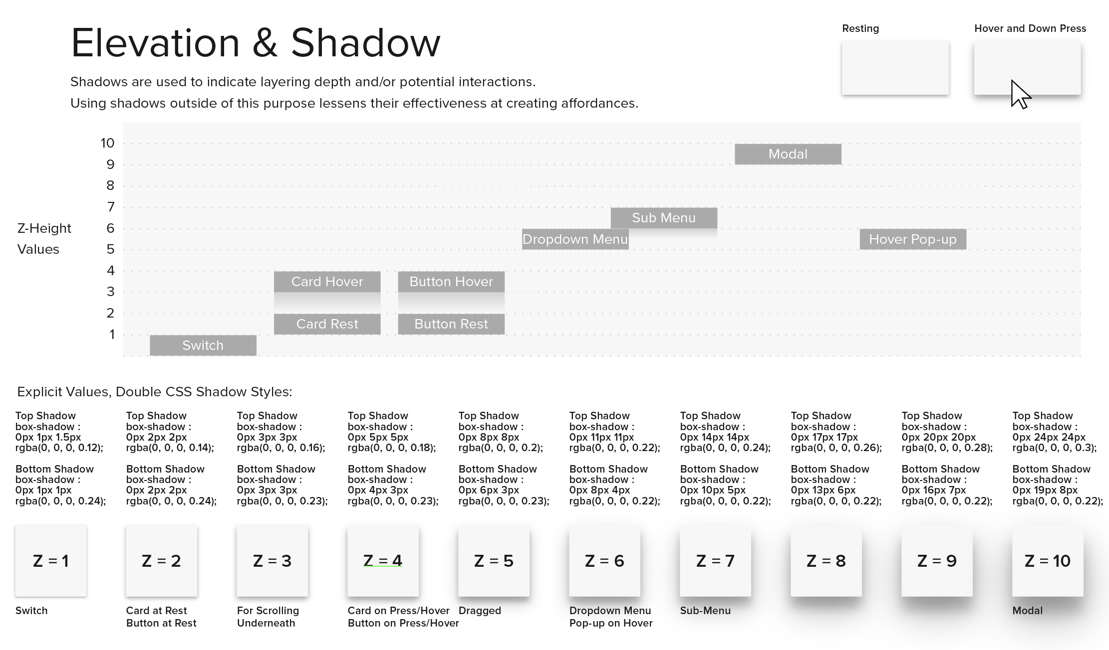
Championed the first in-house design system of Pearson Inc.
Tackled the unique challenges of consistent language barriers, mixing 20-year-old legacy content with fresh content, and our massive scale of workflows.
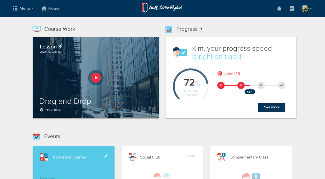
90’S UI TO ROBUST PLATFORM
From this core experience to my platform redesign seen here. Read on to find out how.
Goal #1: Instill the Value of Design
After taking the design reigns I was fortunate to be surrounded by development teams and product owners open to trying new methods if it meant building better products. They taught me a lot about their agile development process, and coming in with fresh eyes I could see our stumbling blocks—largely a lack of integrated design thinking.
With a knack for explaining the “why” of design and colleagues eager to build better products faster, these solutions were an easy sell.
EMBED DESIGNERS IN DEV CENTERS
Teams being distributed around the world meant our direct design presence was always limited by an hour or two of overlap; quality assurance was the only “testing” we had a budget for; and everyone put a different value on design.

When the budget allowed for hiring, I pushed to hire designers alongside our engineers, in Poznan and Chennai. We immediately harnessed these benefits:
Stronger design communication with developers (in-person vs hand-offs)
More diverse design talent enhanced perspectives and innovation.
Always accessible design feedback allowed engineers to work through questions on the fly.
TEST, TEST, TEST
Testing was another piece that was missing from our process. The quality of modern apps is closely related to the speed of Build—Measure—Learn feedback cycles. If you’re not measuring often, you’re not often sure of what needs attention.
Beyond the benefits of testing itself—finding opportunities for improvement—it was also very effective for everyone involved to deepen their knowledge of the problems we were tackling. Taking these two benefits into account, I sold 3 different scales of testing and here’s what we achieved:

To get there every quarter had a lot of evangelizing to stakeholders and an increased testing cadence at the small scale. After gaining the budget to send a trusted California employee to test students and staff in China, the actionable discoveries were clear and allowed us to start medium scale testing trips—Poland employees to German testing center. This lead to the budget for large scale professional testing of our entire ecosystem.
At this point, our global team from engineers to the president of the company was appreciating the value of design beyond making things “pop’!
Goal #2: Redesign with Clarity of Purpose
Our agile global teams raced to put software in the hands of students and teachers that just met the needs of each product individually, we were operational but it wasn’t pretty.
After repeating the mantra “Quality over Quantity” over and over again buy-in started to build with stakeholders around my own dramatic redesign, visually and structurally. The idea was simple: improve core experiences before building out endless new features.
Design Manifesto
To gain buy-in and enhance the impact of a redesign, I defined a set of actionable principles for easy and universal digesting by everyone I worked with. This document allowed me to layout a concise and clear strategy to address my favorite problem we had to work around: non-English speakers using an English only UI! While explicitly strategies were born from this document, this iteration allowed for broad collaboration from a unified foundation of constraints.

The first question of this had been something I had been considering for some time, the last two questions were the direct result of coalition building around the initial question “How can the design team help you?” Getting other departments on board was not only helpful for stakeholder buy-in, but critical for effective long-term execution.
Goal #3: Executing an efficient redesign
Redesign approved—now what? The plan was to get cracking with a nimble but branded design system, and reconsidering our IA while we could.
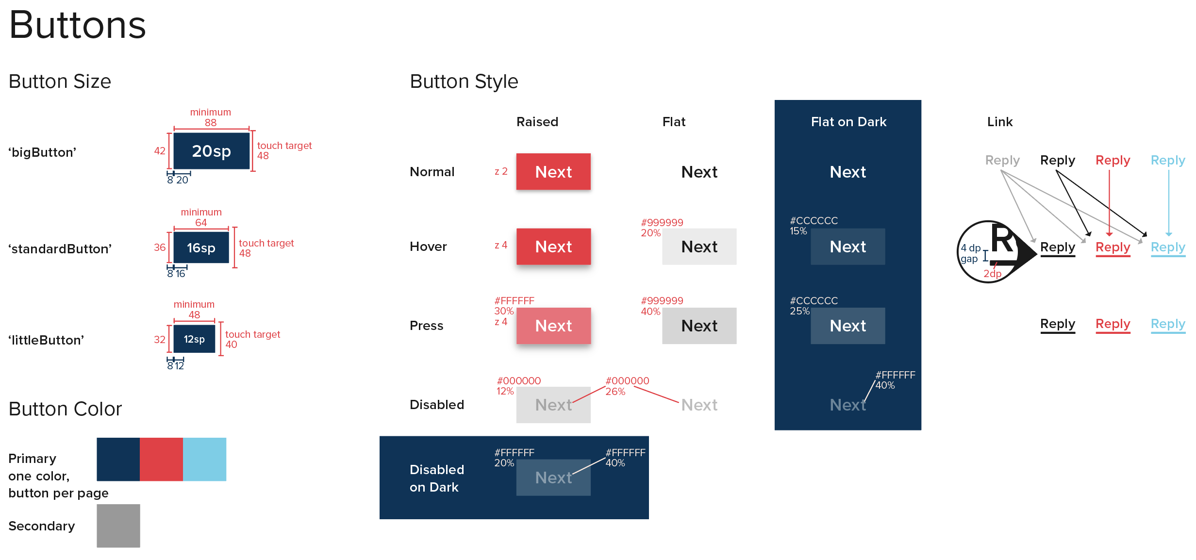
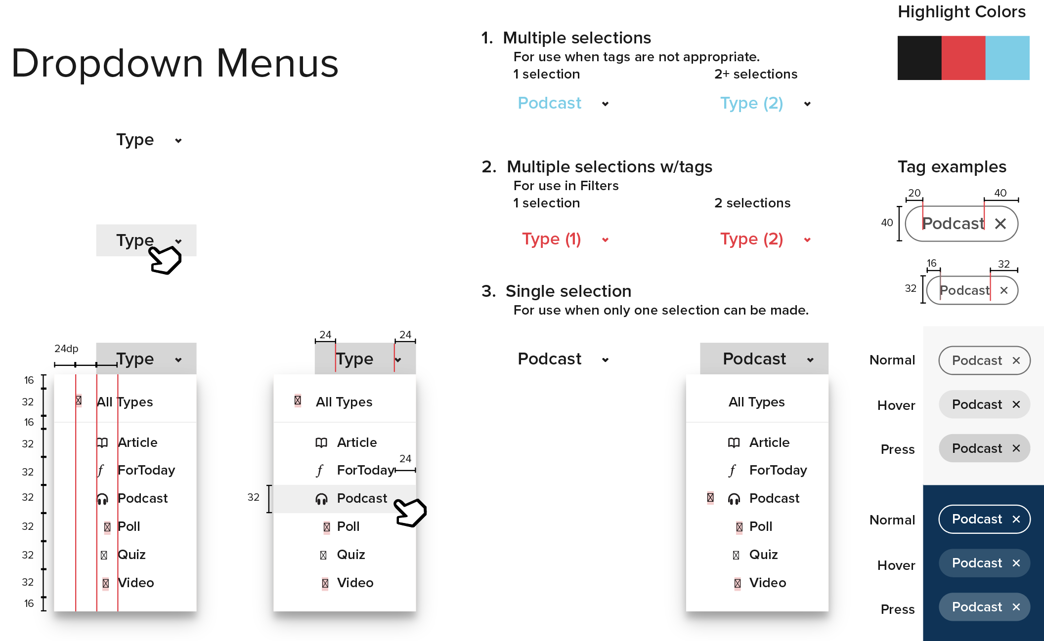
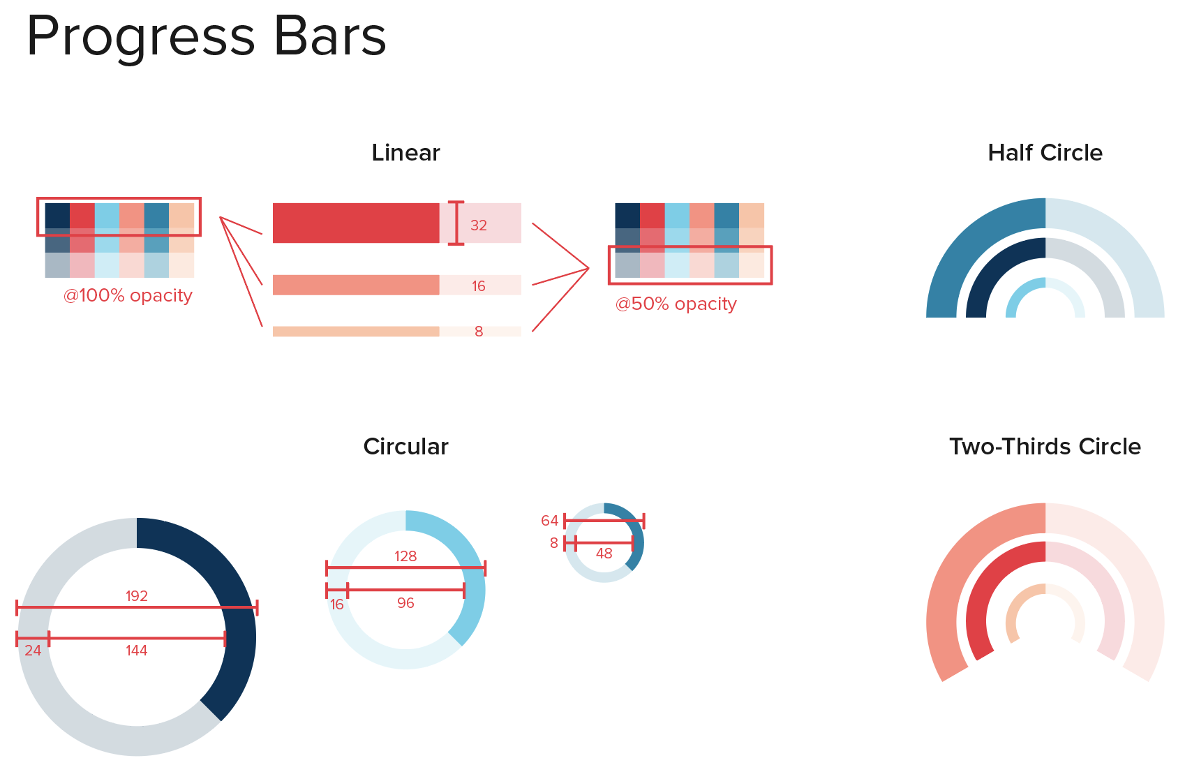
I attribute the success of our design system to it’s simplicity. 6 different products, all at different stages of development were able to capture various characteristics from WSE 2.0—all starting from the principles above. No verbose documentation meant we could build out components in no time, as they became needed, but also allowed designers (and the occasional developer) to more easily contribute when they had an idea—helping to build buy-in and actual use. It lived in the software we all used (Illustrator and Sketch). Modifying an existing robust system (Material Design, which had just been released) meant there was always a back-up solution in place so nobody was left without a decent solution.
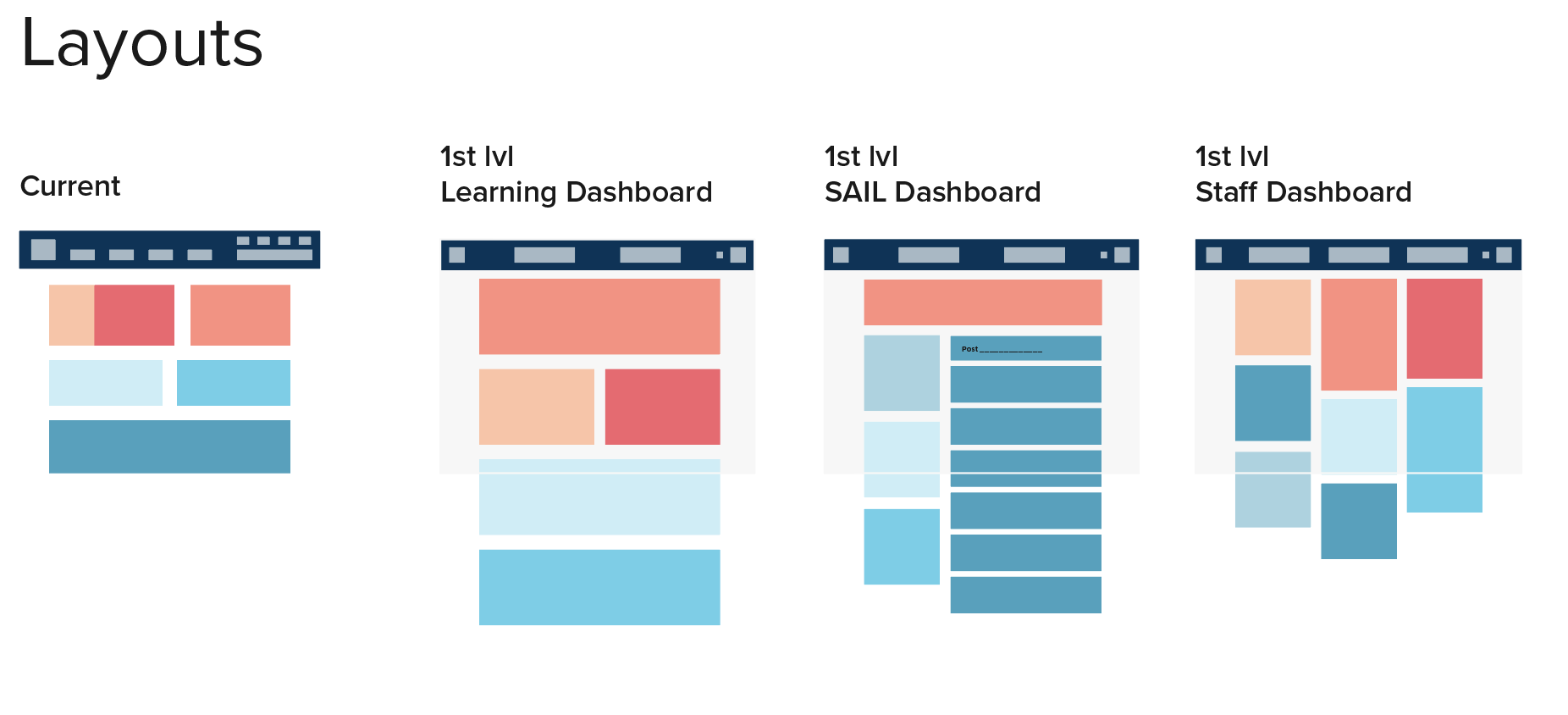
Navigation
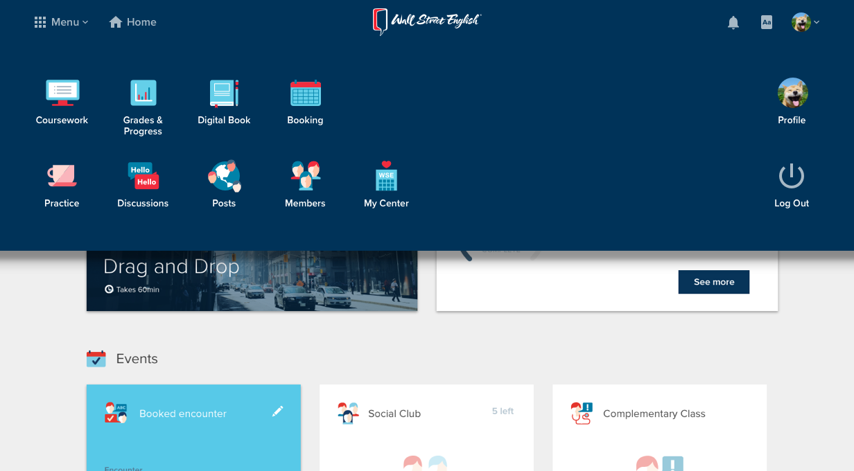
Navigation is tricky for non-English speakers in an immersive English application. Directing people who may not be able to read your signage was probably my favorite challenge! I broadly covered some of my solutions in “Principles” above—see “Visually minimal”, “Strong clarity”, and “Limited affordances”.
In practice this meant concise and clear copy, pairing text with icons, and reserving certain patterns. Cards for instance, all indicate complete interactivity for a single purpose. Another unique solution I designed was the nav bar. To aid in site discoverability, there is only one nav menu, but it is activated from either corner. Students loved this.
What I learned
Make everything as easy as possible—for your users, designers, devs, product owner—for everyone. From a UI requiring less mental and physical dexterity to interact with, to getting your point across quickly—absolutely everyone appreciates this.
Managing designers requires empathy and communication. Getting to know them personally and finding out what they love about their job is the best way of helping them produce their best work.
Most critically, buy-in around a clear vision make it all happen. Making this a priority with everyone seemed directly correlated to the quality and speed of work we achieved.
Pearson sold Wall Street English for 300 million, and sent me to impact their Higher Ed products.